Selected projects
Overview
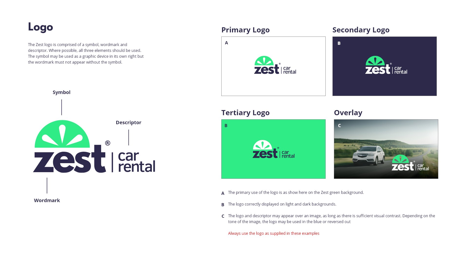
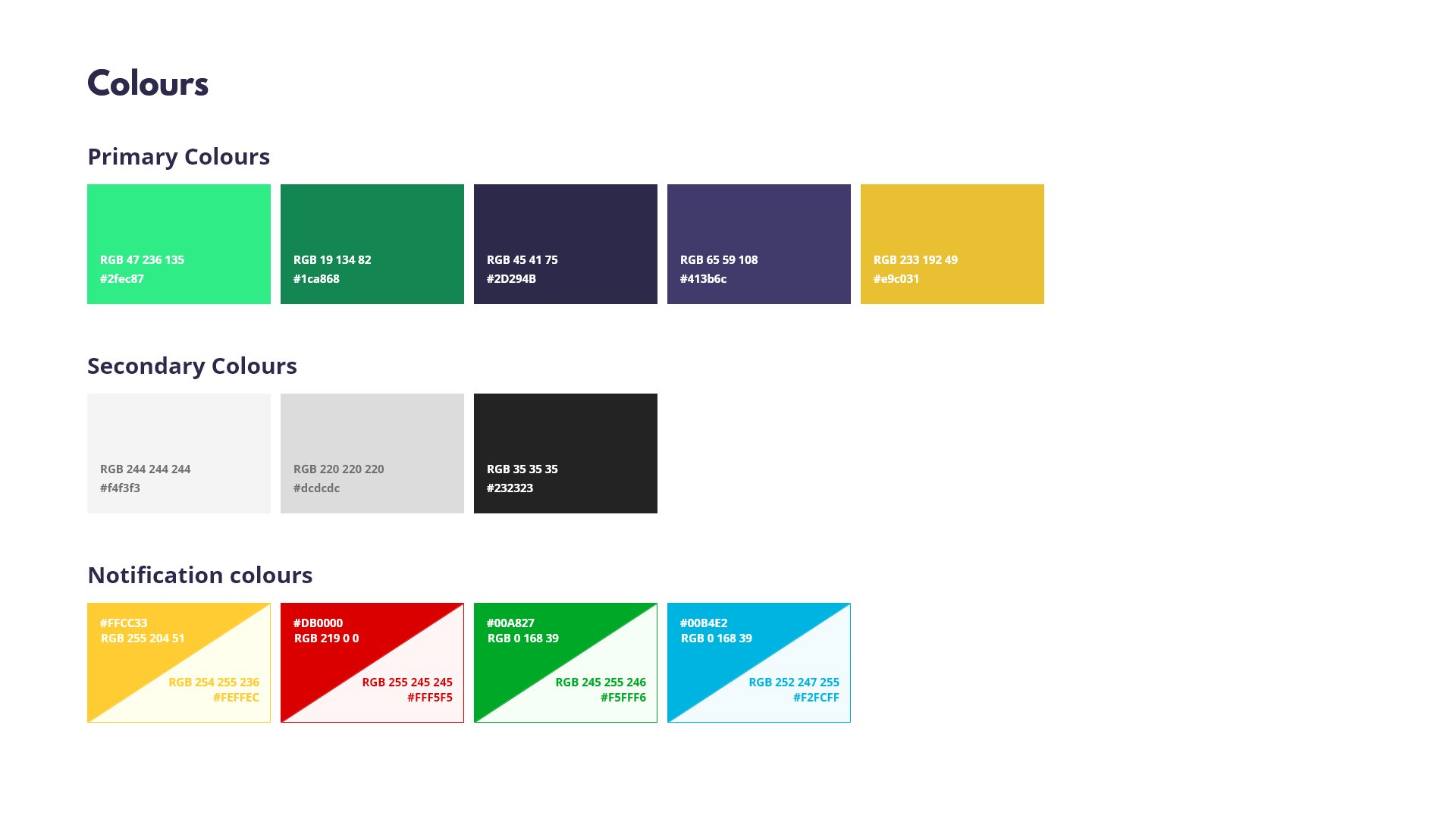
Created a comprehensive brand style guide for Zest Car Rental to establish a consistent visual identity across all digital and marketing touchpoints. The guide covers the full design language — from the colour system and logo usage rules through to typography, components, and notification states.
What I did
Defined the primary and secondary colour palette with RGB and hex values for all platforms
Created detailed logo usage guidelines covering primary, secondary, tertiary, and overlay applications
Documented notification colour system covering warning, error, success, and info states
Produced the full guide in Adobe XD as a living reference for the wider team
Outcomes
A single source of truth for the Zest brand used across design and development
Consistent logo and colour application across the website, marketing, and product
Reduced inconsistencies in how the brand was being applied across teams
Tools used
Overview
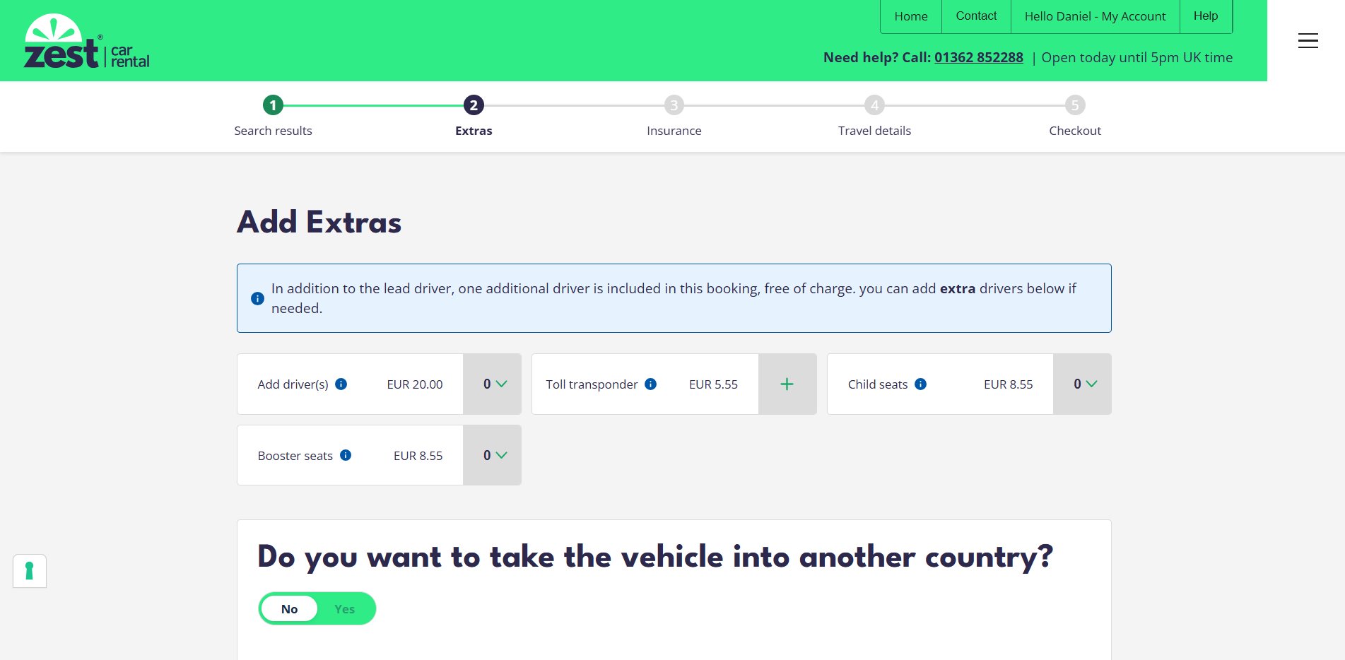
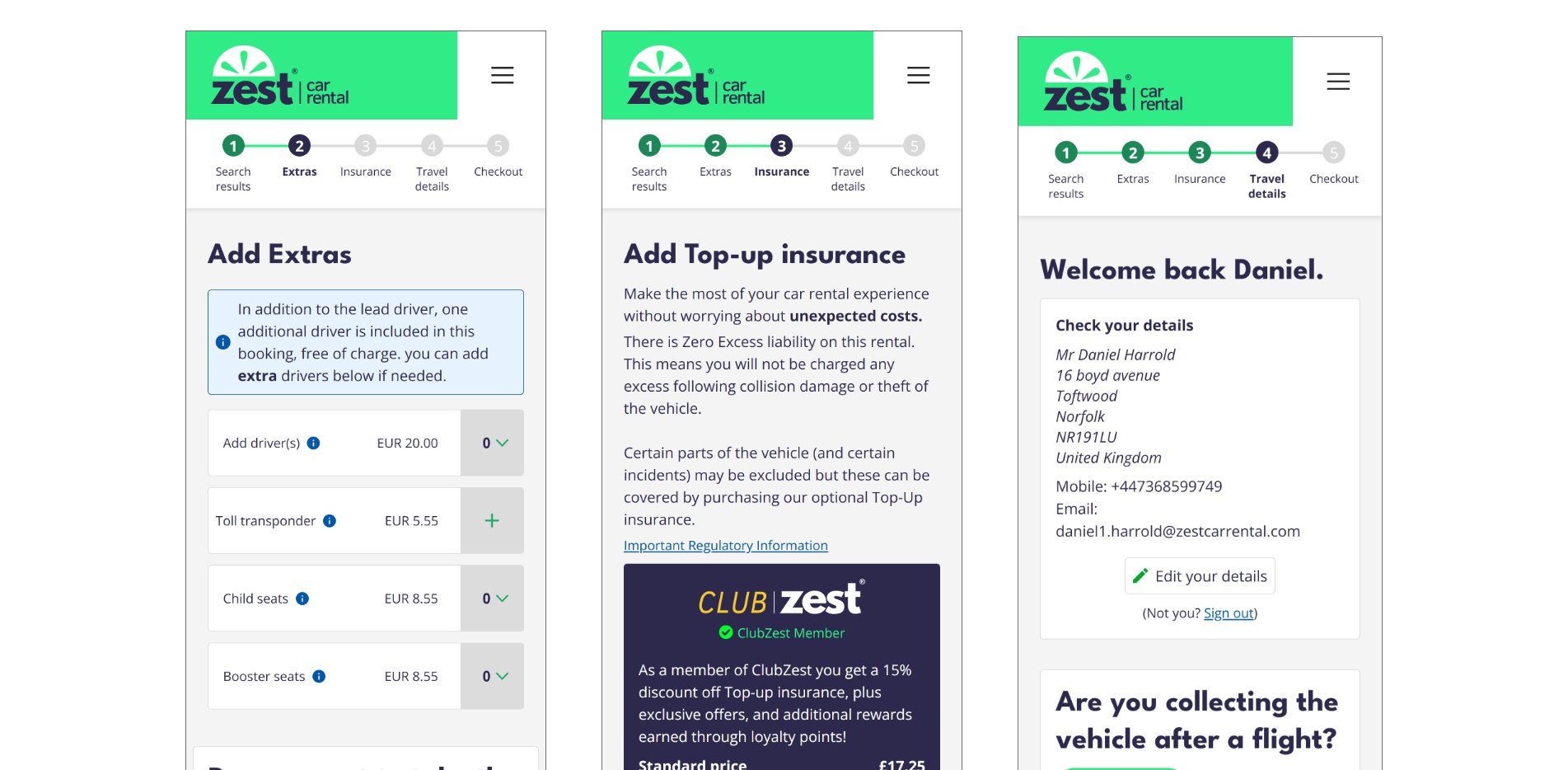
A full redesign of the Zest Car Rental booking process — covering every step from search results through to checkout. The project involved designing a clear, frictionless multi-step flow across both desktop and mobile, with a focus on reducing drop-off and improving the overall customer experience.
The flow
Step 1 — Search results: vehicle selection and filtering
Step 2 — Extras: add-ons including additional drivers, toll transponder, child seats, and cross-border travel
Step 3 — Insurance: top-up insurance options with ClubZest member benefits
Step 4 — Travel details: pre-filled customer information with edit capability
Step 5 — Checkout: final review and payment
What I did
Designed the full multi-step booking journey for desktop and mobile breakpoints
Created a clear step indicator component to keep users oriented throughout the flow
Designed responsive extras and insurance selection screens with accessible UI patterns
Built fully interactive prototypes in Adobe XD for both desktop and mobile
Outcomes
A consistent, on-brand booking experience across all devices
Reduced visual complexity at each step to keep users focused on the task
Prototypes approved by stakeholders and handed off for development
Tools used
Interactive prototypes
View the full clickable prototypes for both desktop and mobile.
Analysis decks
View the research and analysis presentations that informed the redesign.
Overview
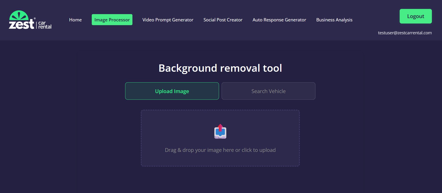
A bespoke internal AI-powered toolkit built from scratch for the Zest Car Rental marketing team. The frontend is a multi-tool web application with Firebase authentication — controlling user access and roles. Every tool's backend runs entirely through N8N workflows and external APIs, with no traditional server infrastructure required.
Tools built
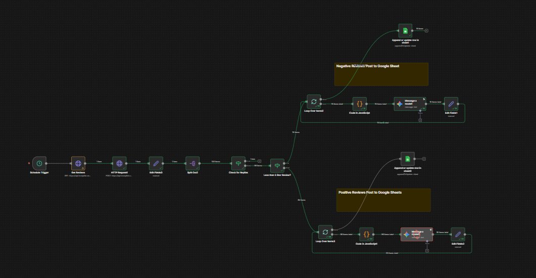
Trustpilot Auto-Responder — fetches unanswered reviews via the Trustpilot API, sorts them into positive and negative, uses AI to craft tailored responses, and posts everything to a Google Sheet for human review and approval. A second workflow runs every 12 hours and auto-posts approved responses back to Trustpilot.
Vehicle Image Finder & Editor — takes a user search query, finds a vehicle image matching Zest's criteria (3/4 front-facing view), removes the background using AI, and outputs a web-optimised image ready for the website.
Email Content Analyser — analyses marketing emails for readability, spelling errors, and layout issues, then generates a structured PDF report.
Business Analysis Tool — takes a URL, scrapes and analyses the company's website, and produces a PDF report on what they do, their positioning, and key details — used for competitor analysis and new business prospecting.
What I built
Designed and built the full frontend web application with a consistent UI across all tools
Implemented Firebase authentication with user roles to control access per tool
Built all backend logic entirely in N8N — no traditional server, just workflows and APIs
Integrated Trustpilot API, Google Sheets API, AI language models, and PDF generation
Designed a human-in-the-loop approval system so the team stays in control of all AI outputs
Outcomes
Saved the marketing team significant time on repetitive tasks previously done manually
Trustpilot response rate improved through faster, consistent, AI-assisted replies
Vehicle imagery workflow cut asset production time from hours to minutes
Gave non-technical staff access to powerful AI tools through a simple, branded interface
Tools used
Overview
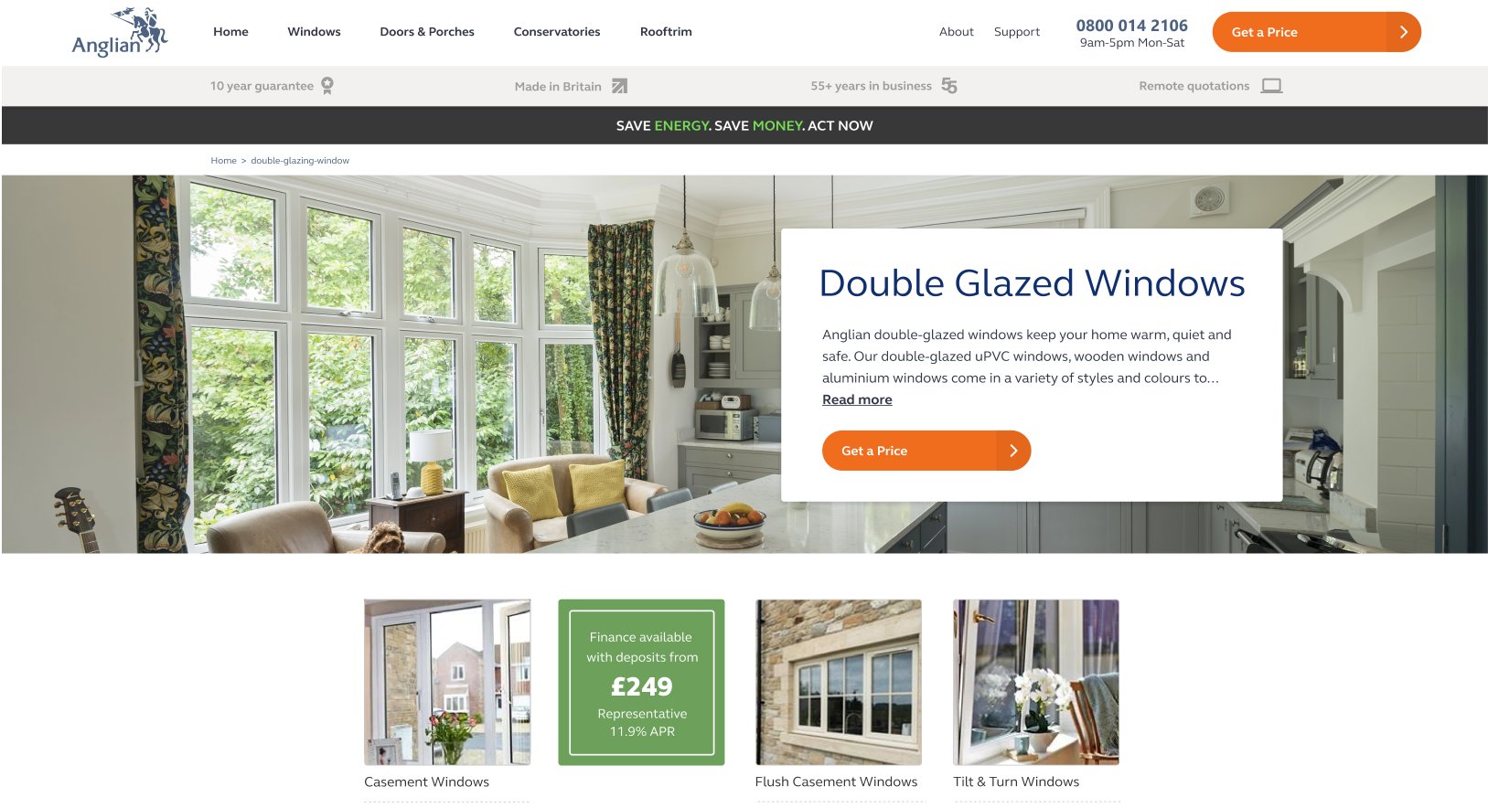
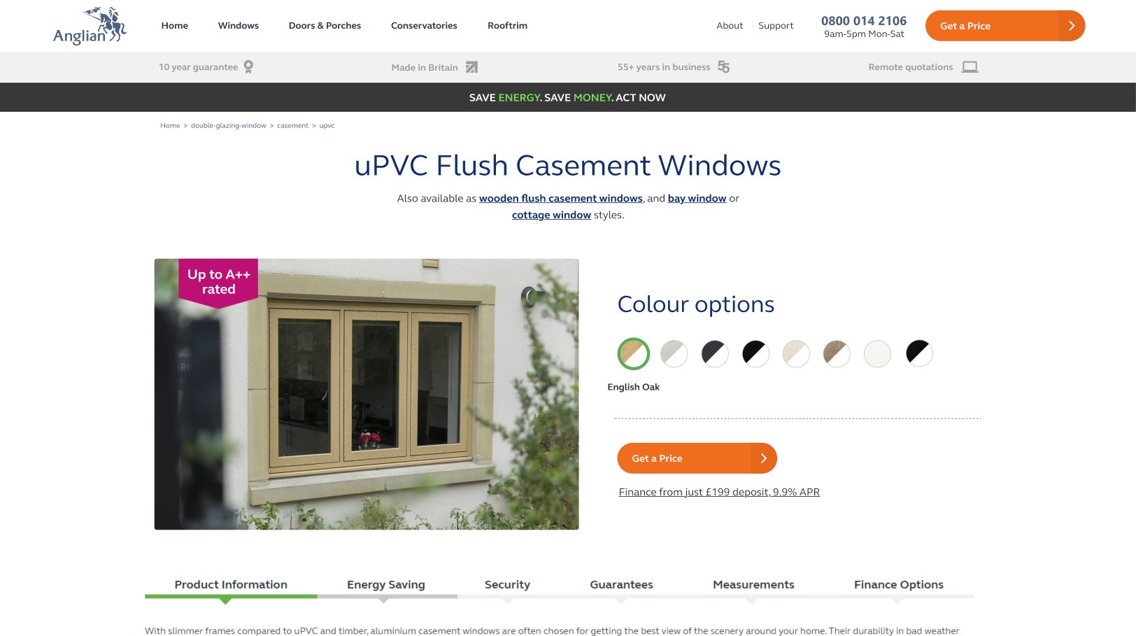
A full end-to-end redesign of the Anglian Home Improvements window buying journey — from the category landing page through to individual product pages. The brief was to reduce friction, improve clarity, and increase the number of users reaching the quote request stage.
Process
User research and heuristic analysis to identify drop-off points in the existing journey
Wireframing and low-fidelity prototyping to explore structural improvements
High-fidelity designs in Adobe XD, iterated through stakeholder feedback
Front-end build in Sitecore CMS, followed by A/B testing and results analysis
Outcomes
Improved conversion rate through a cleaner, more focused product page layout
Reduced cognitive load by restructuring the colour selector and CTA hierarchy
Redesigned landing page drove stronger engagement with product subcategories
Tools used
Full case study
View the complete process deck — research, wireframes, final designs, and results.
View XD presentation ↗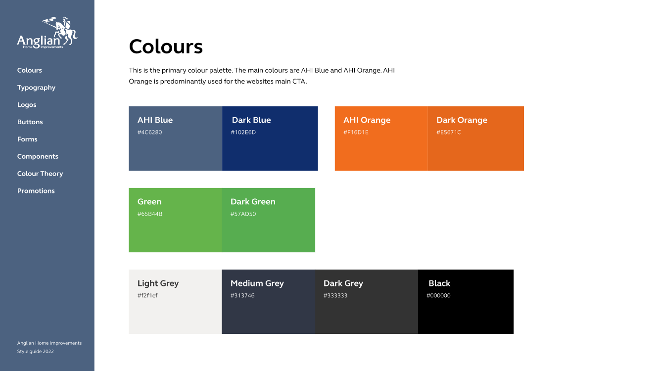
Overview
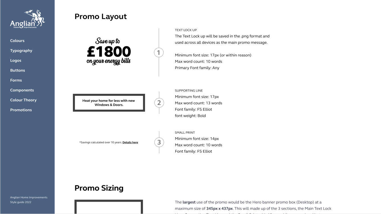
The Anglian website had accumulated years of inconsistency — varying heading sizes, mismatched type scales, and promotional creative applied without a clear system. I audited the entire site, identified the inconsistencies, and created a comprehensive style guide to bring everything into alignment. The guide also defined standards for how promotional creative should be displayed across the site.
Problem
H1 tags, font sizes, and spacing varied significantly across page templates
No consistent rules for how promotional banners and creative were implemented
Different teams were making independent styling decisions, compounding the inconsistency
What I did
Audited the full site to catalogue all typographic and visual inconsistencies
Created a detailed style guide defining the type scale, heading hierarchy, spacing, and colour usage
Defined clear guidelines for promotional creative — sizing, placement, and content rules
Rolled the standards back across the site, updating templates and components in Sitecore CMS
Outcomes
A visually consistent website with a single, shared design language across all pages
A living style guide used by the wider team as a reference for all future work
Significantly reduced the time spent resolving styling conflicts and inconsistencies
Tools used
Overview
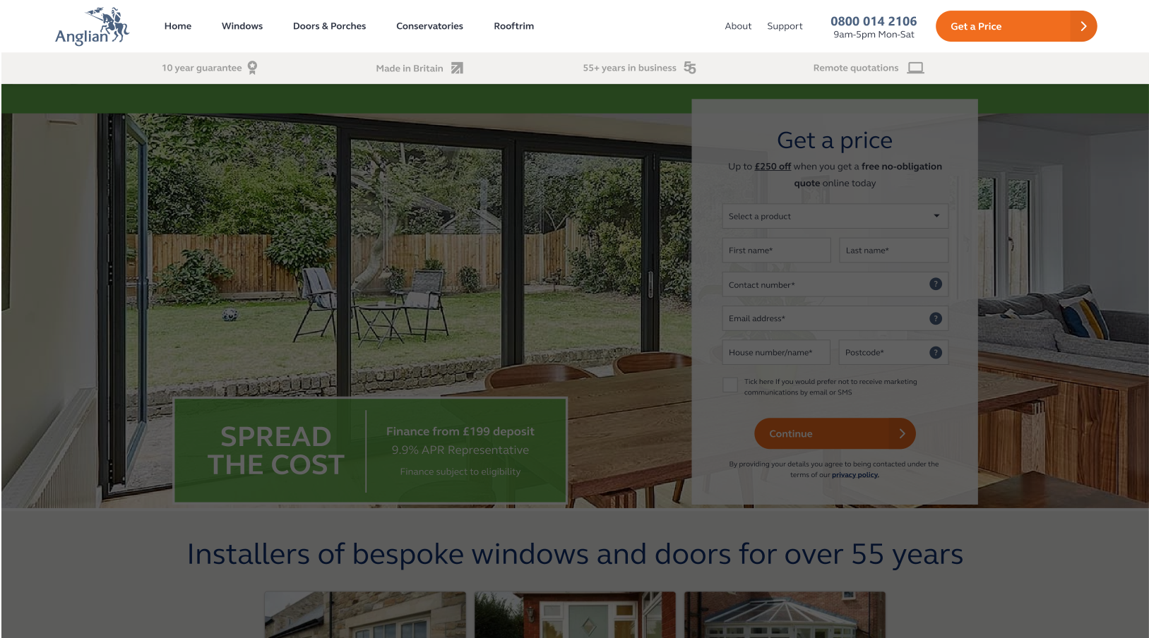
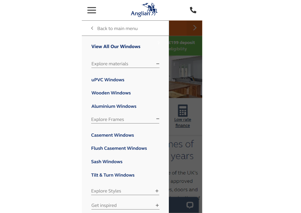
A full redesign of the Anglian Home Improvements navigation menu across desktop and mobile. The existing nav had grown organically over time and lacked a consistent structure, making it difficult for users to find their way around a large product catalogue. The goal was to create a clear, scalable navigation architecture that worked across all devices.
What I did
Audited the existing navigation structure and identified UX pain points
Redesigned the desktop mega-menu layout to improve product discoverability
Designed a new mobile navigation with clear drill-down hierarchy and back navigation
Built an interactive XD prototype to demonstrate the full user flow
Outcomes
A consistent navigation experience across desktop and mobile breakpoints
Clearer product hierarchy making the catalogue easier to browse
Interactive prototype approved by stakeholders for development handoff
Tools used
Interactive prototype
View the clickable XD prototypes — note: only the Windows menu item is wired up in these previews.